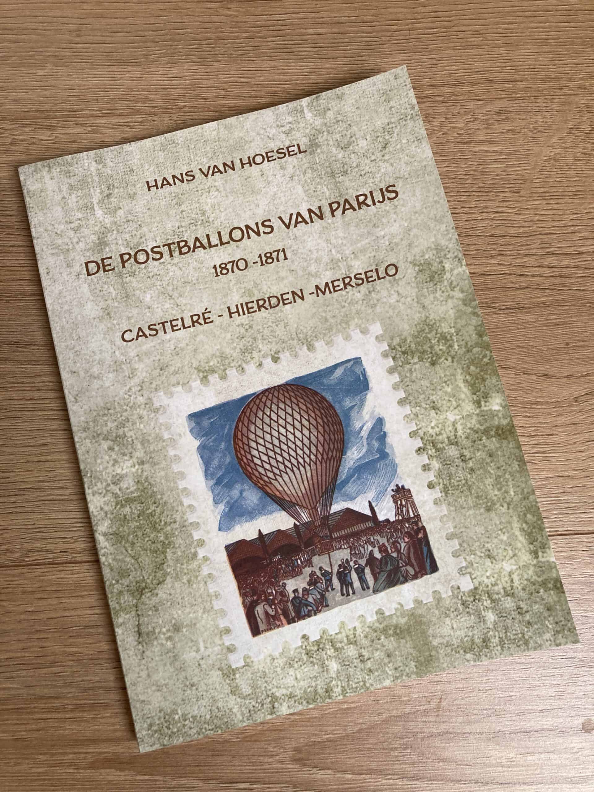
De Postballons van Parijs – Softcover booklet
Author: Hans van Hoesel
124 pages. Published in January 2022
You can contact the author and order the book on the website here
Author: Hans van Hoesel
124 pages. Published in January 2022
You can contact the author and order the book on the website here
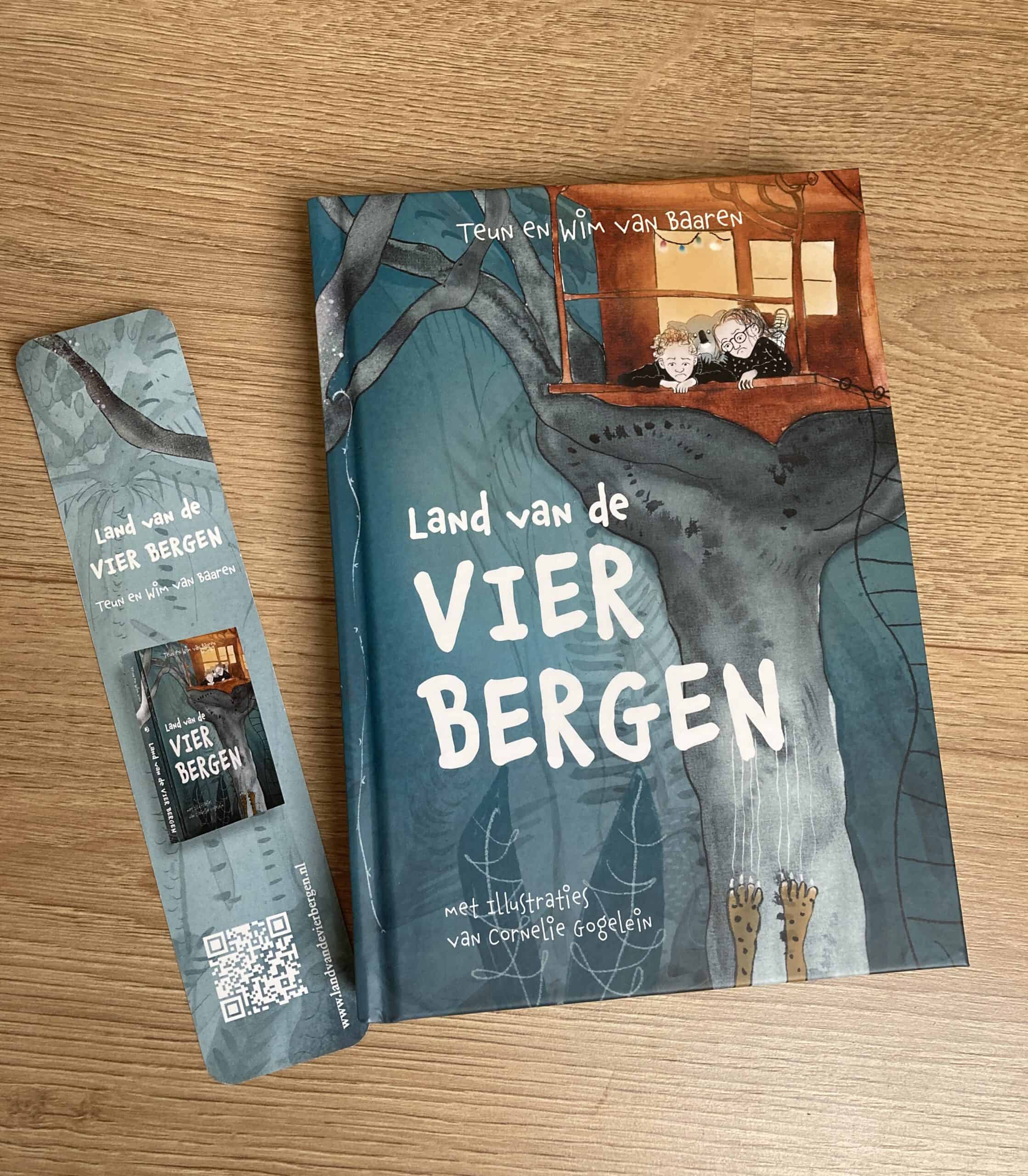
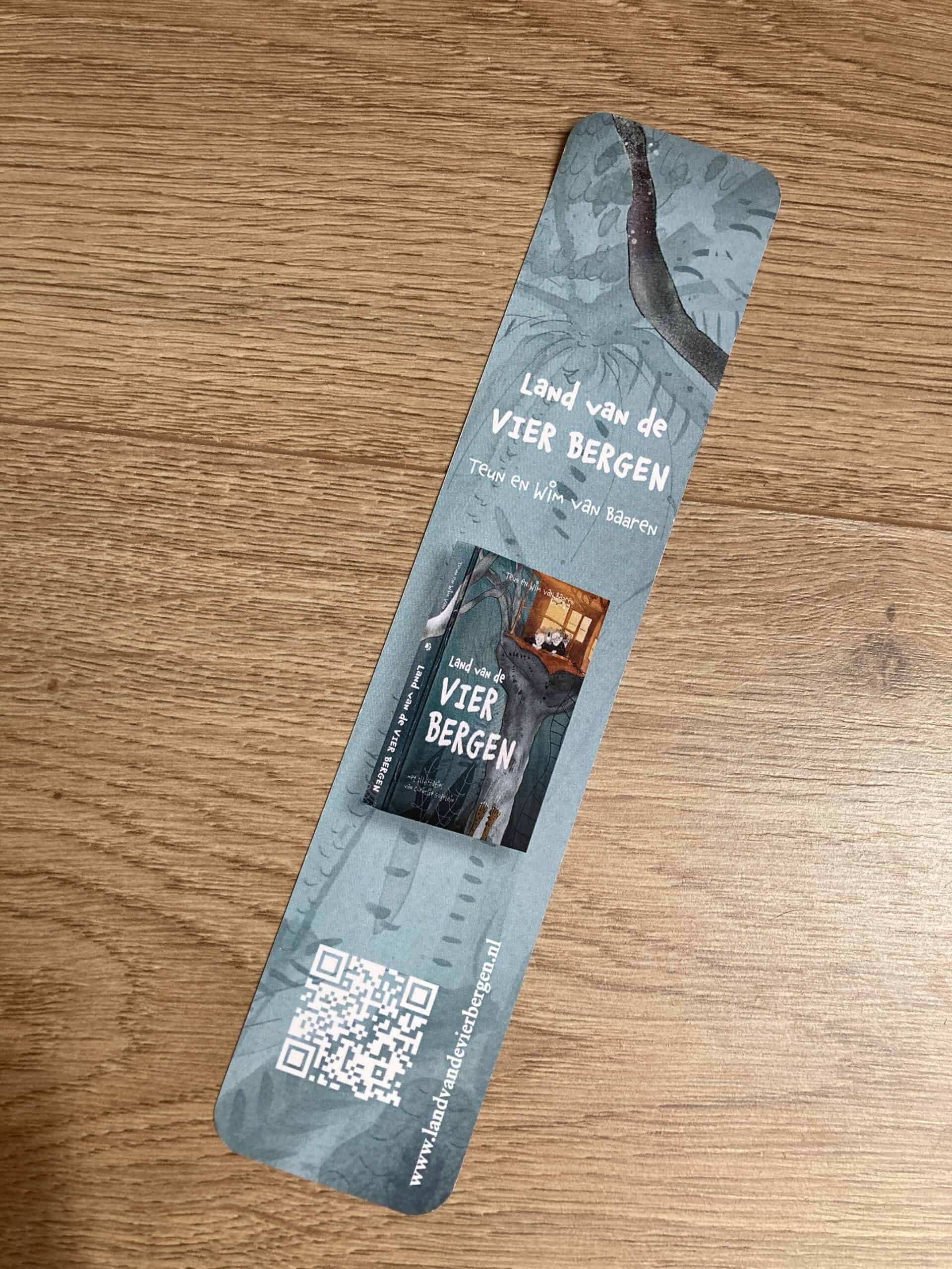
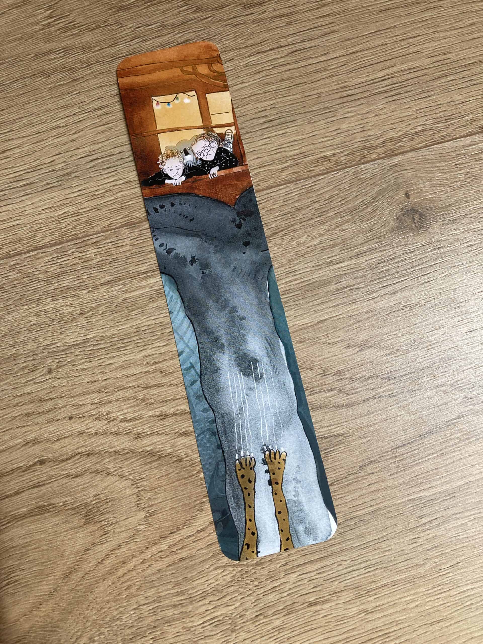
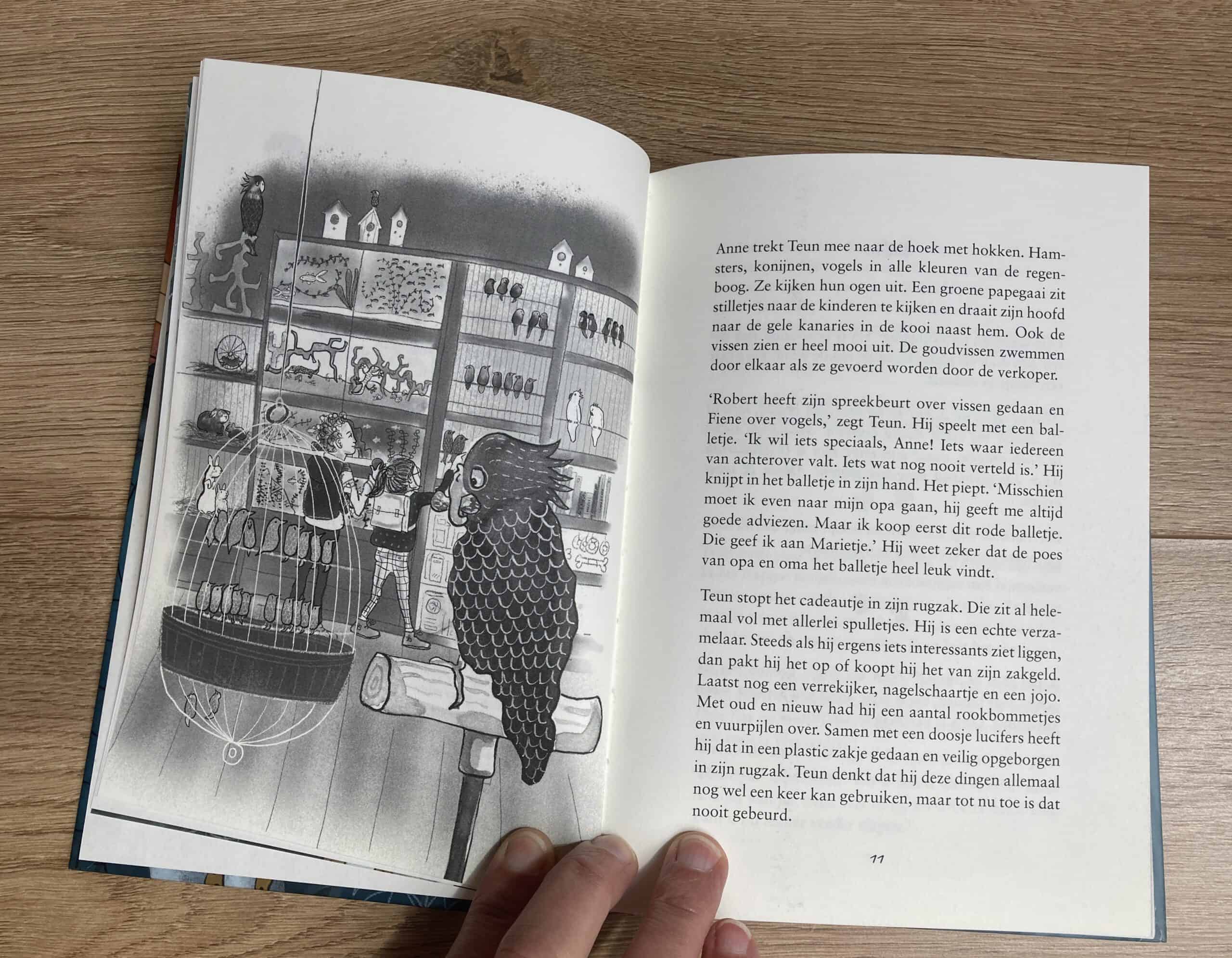
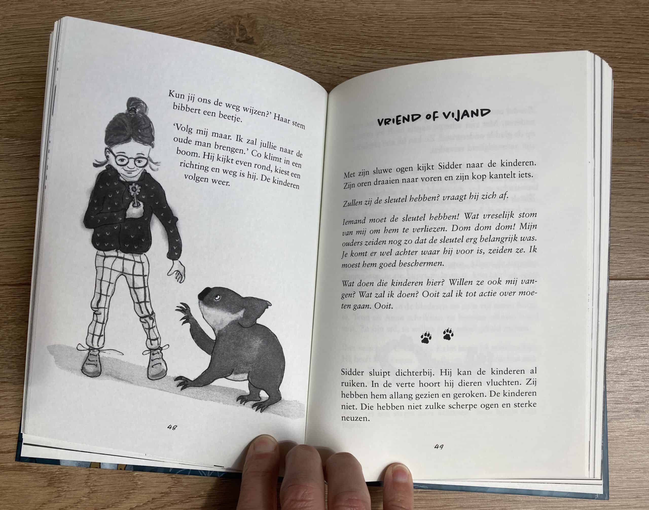
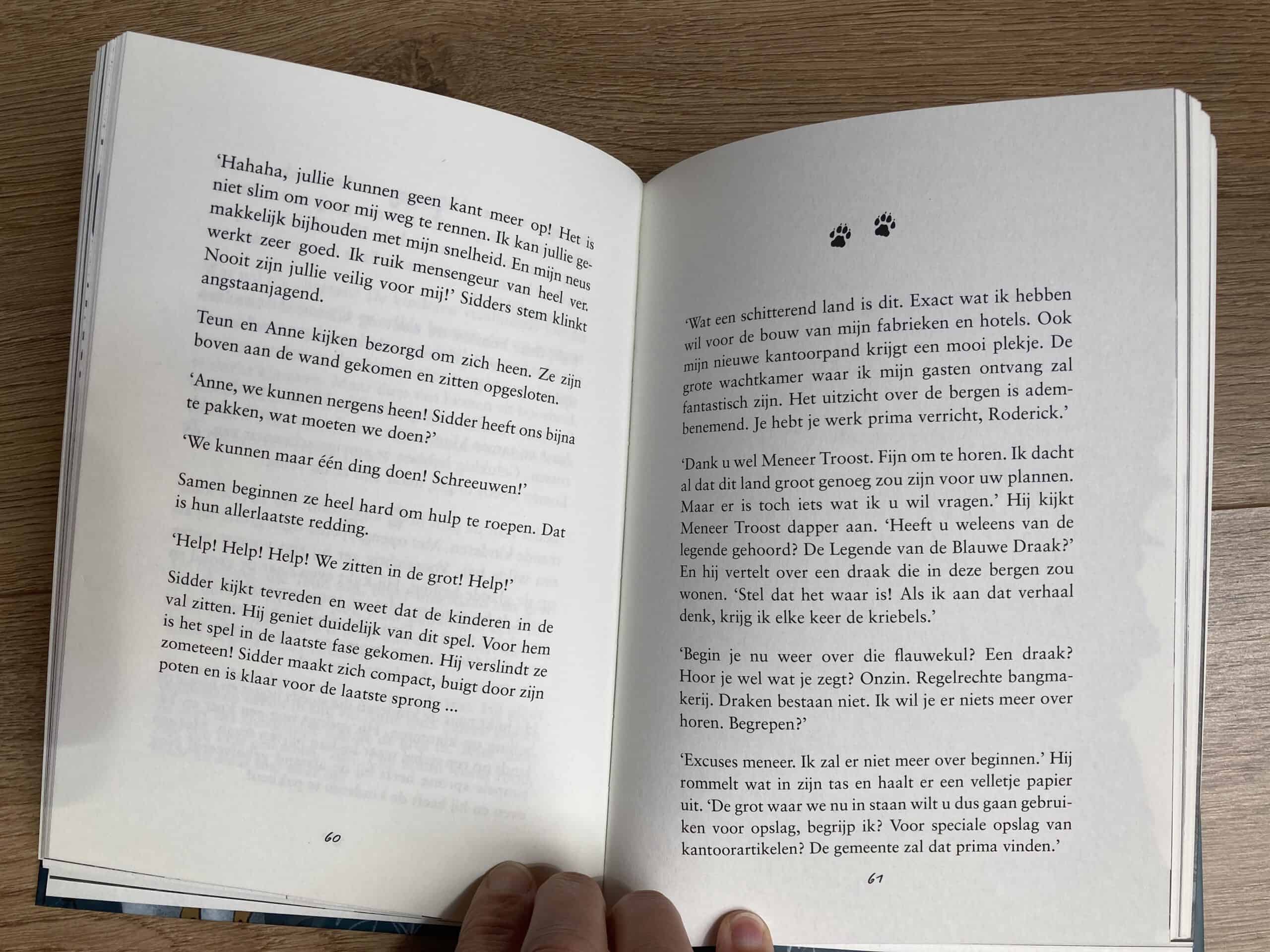
Authors Teun & Wim van Baaren. Illustratrice Cornelie Gogelein.
168 pages. Published in April 2022. Printed by New Energy
You can order the book on the website of Teun & Wim here.
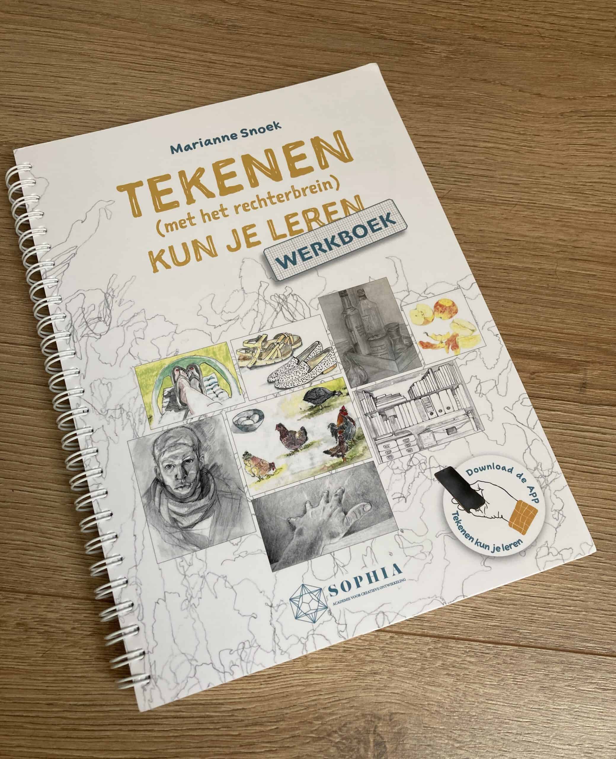
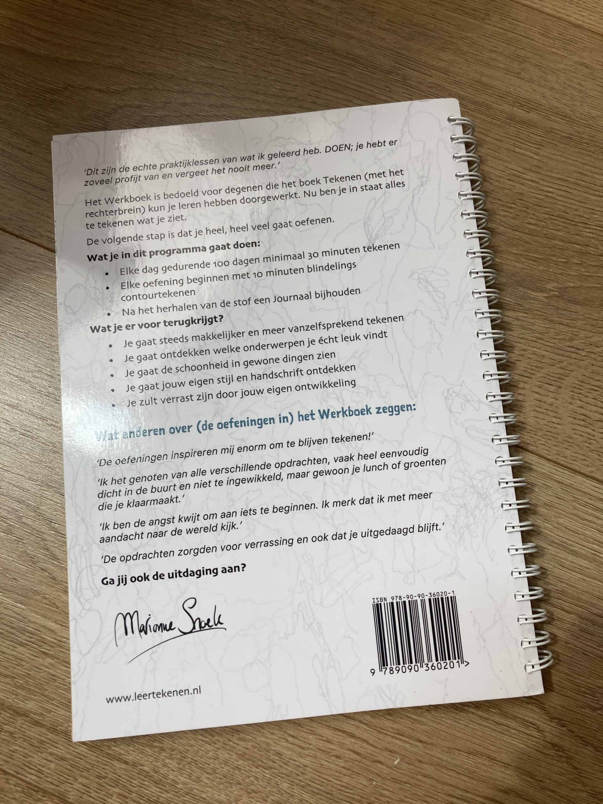
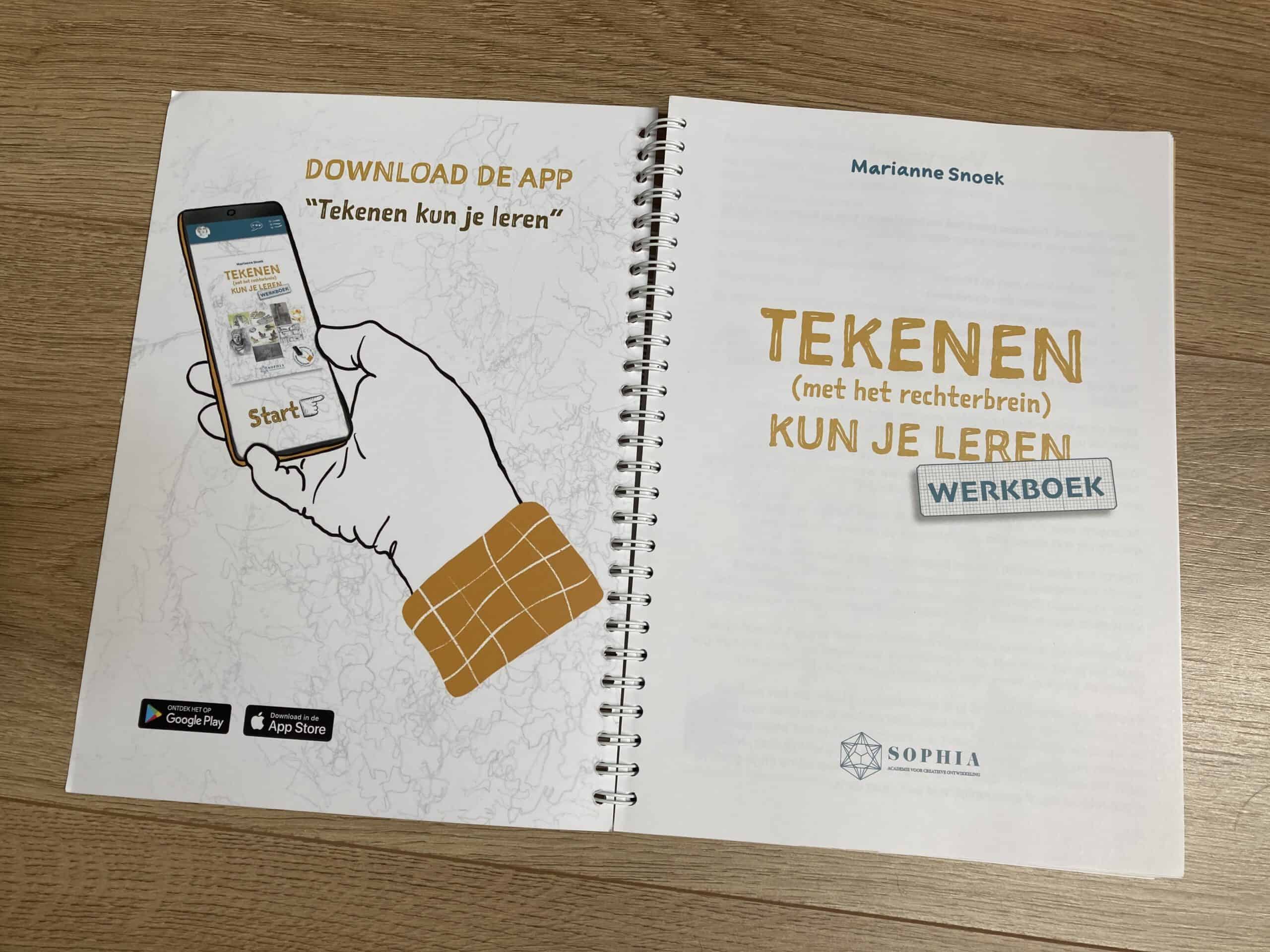
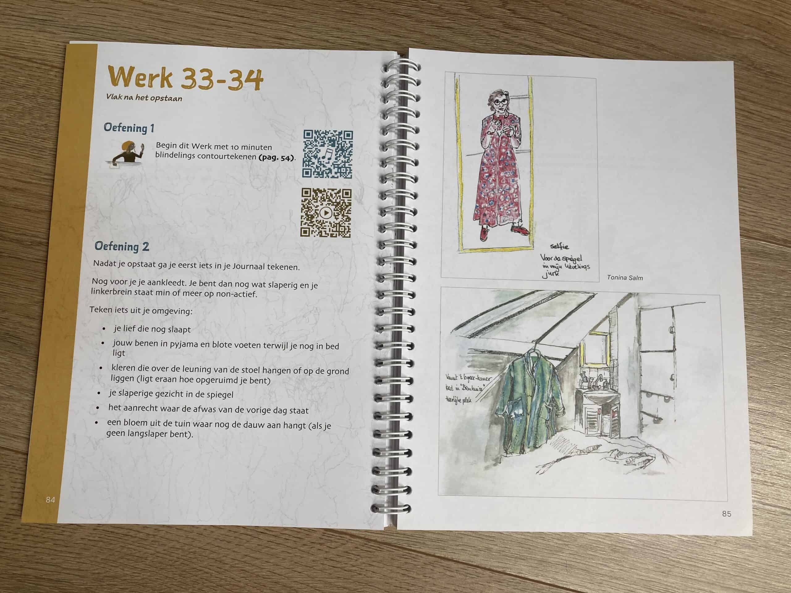
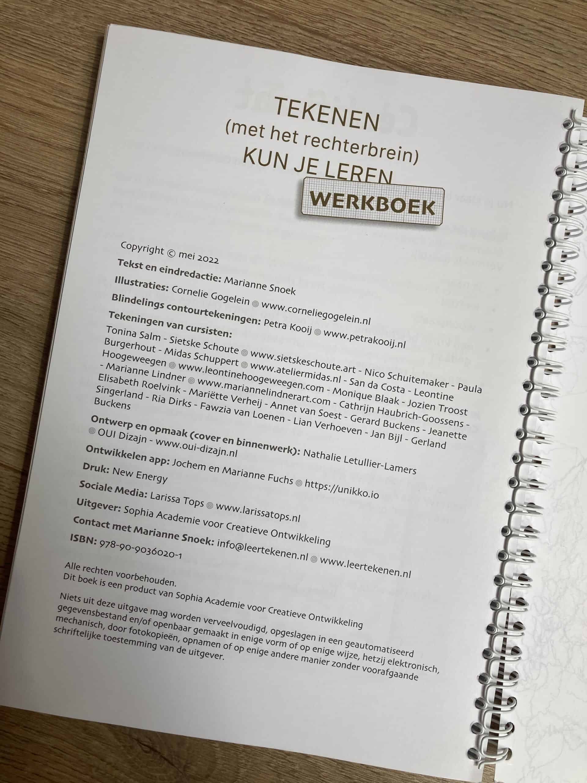
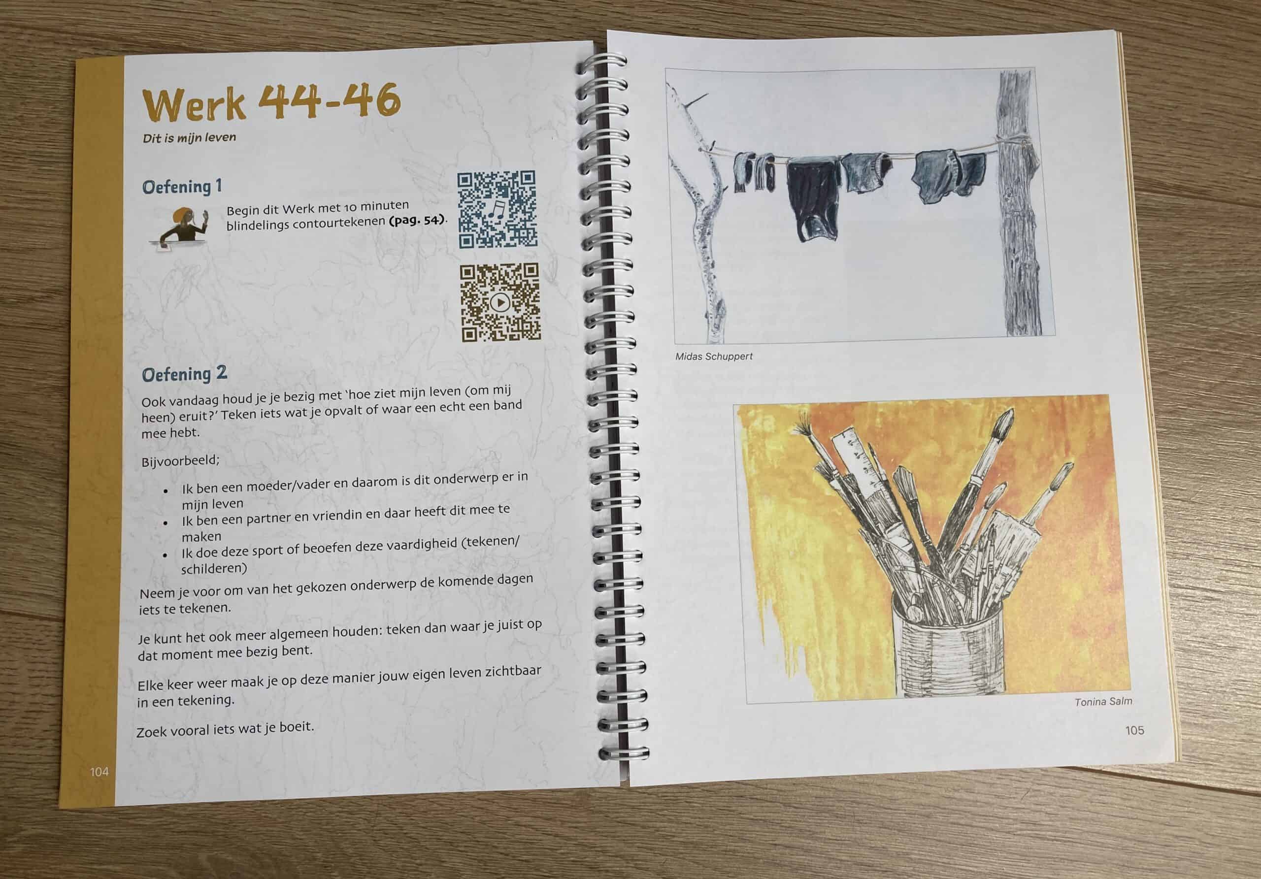
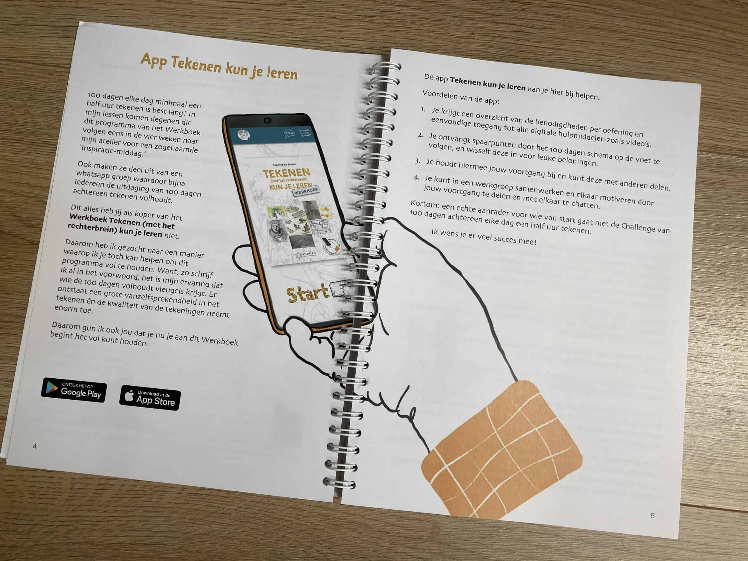
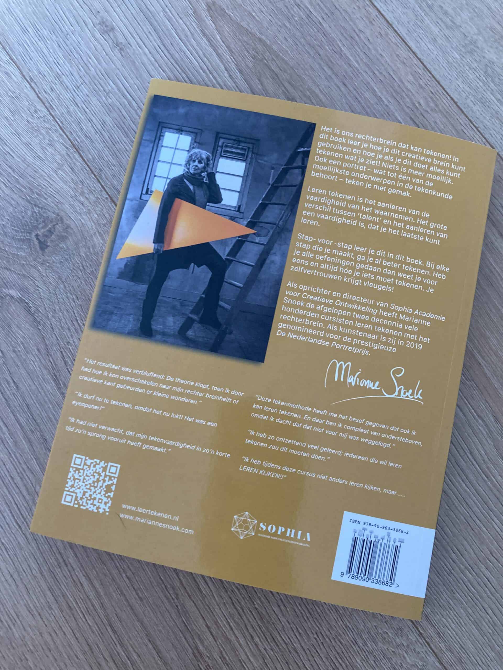
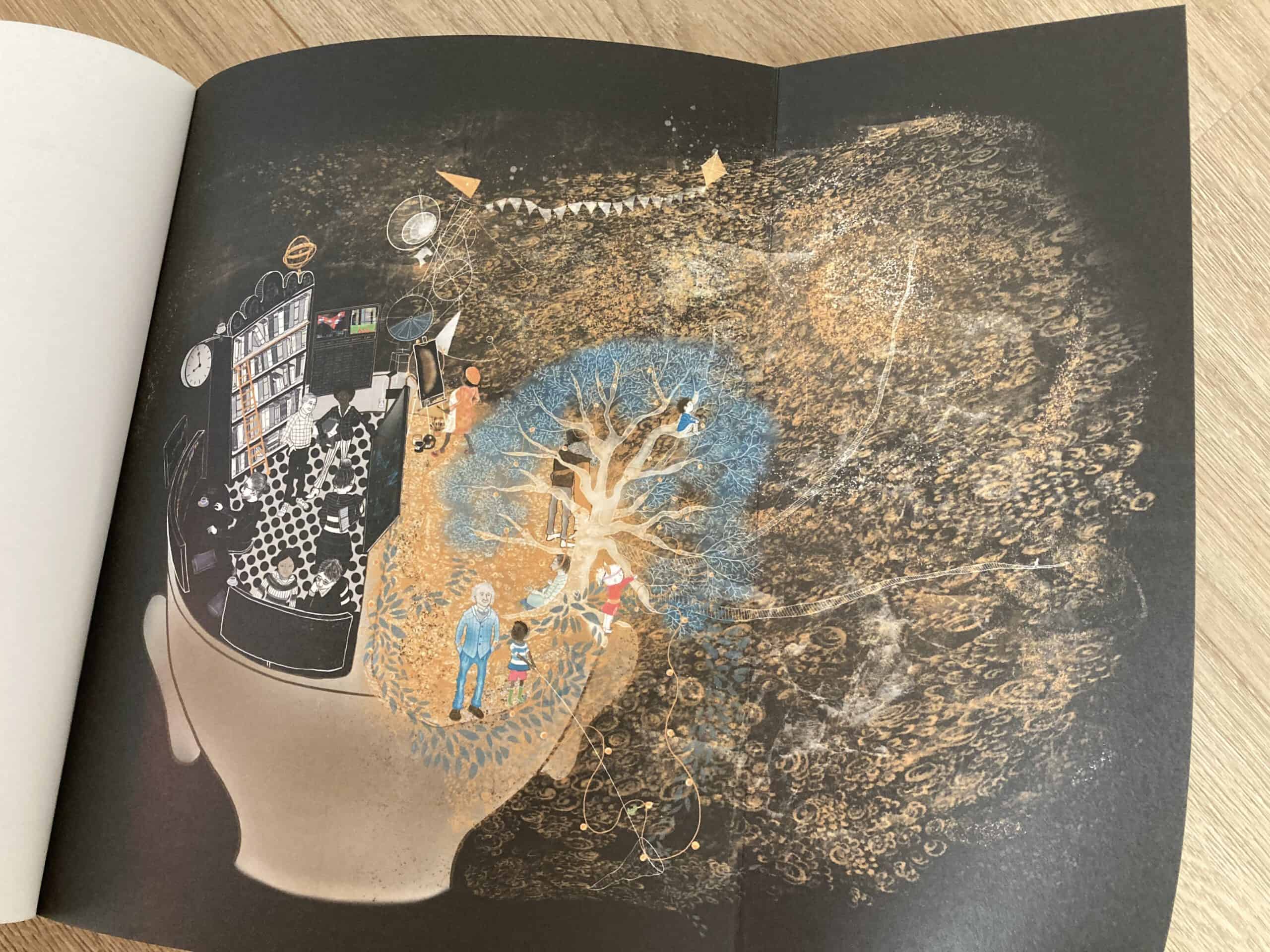
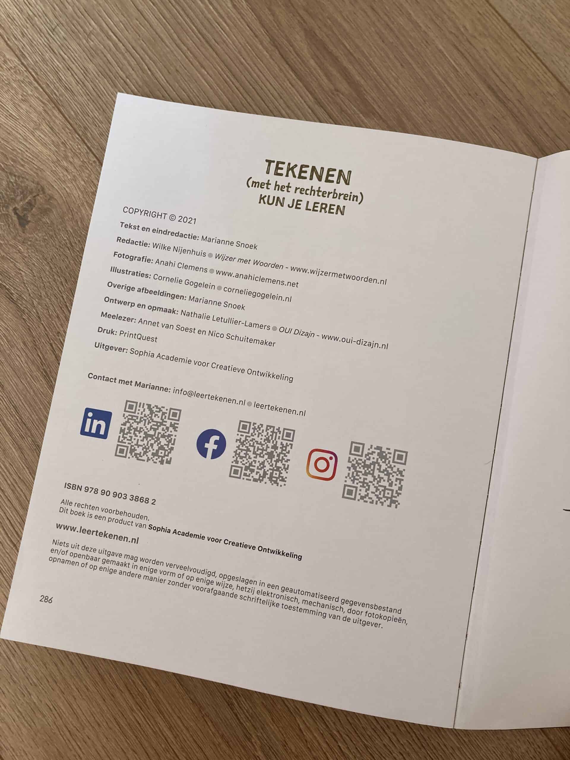
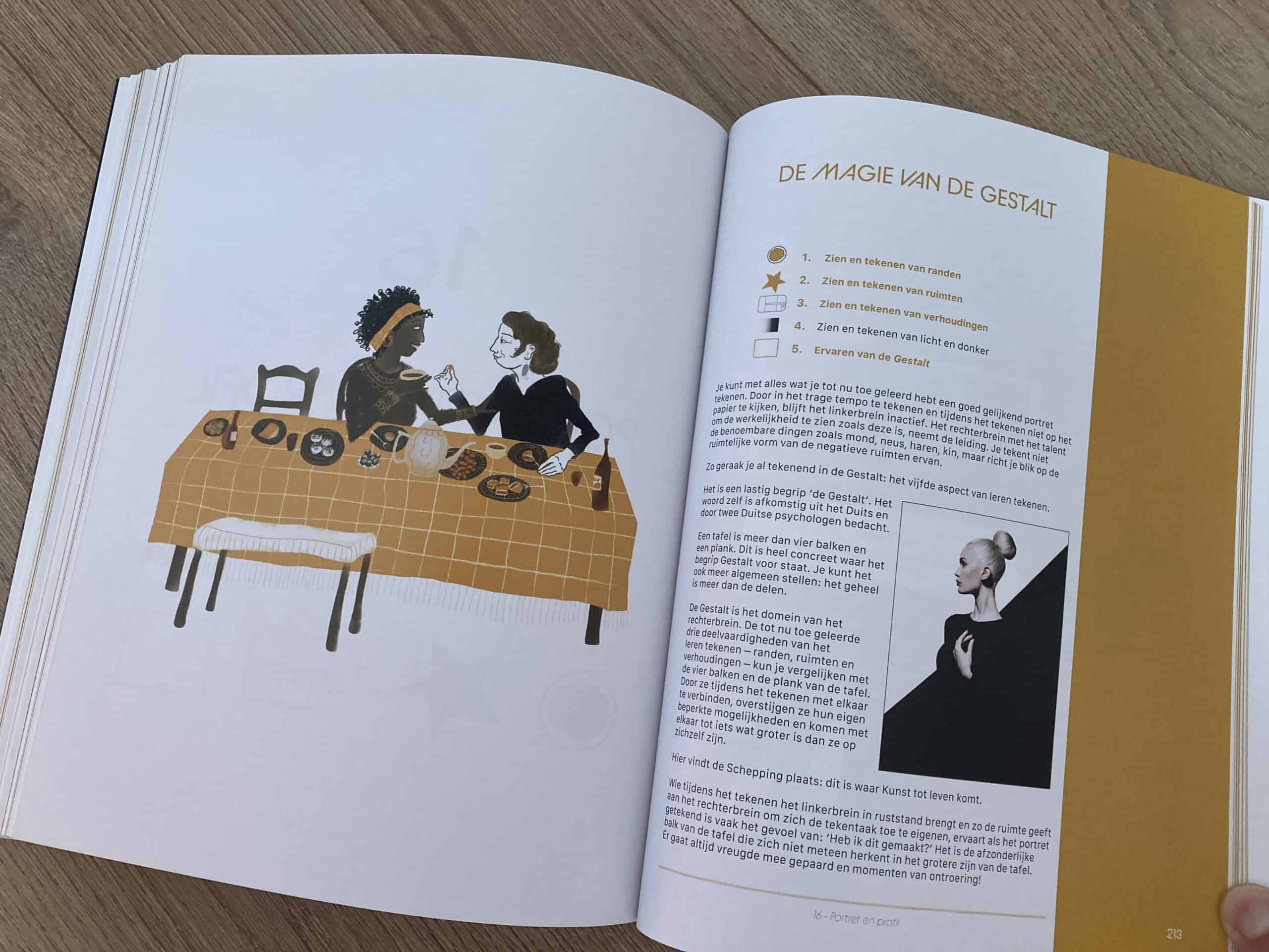
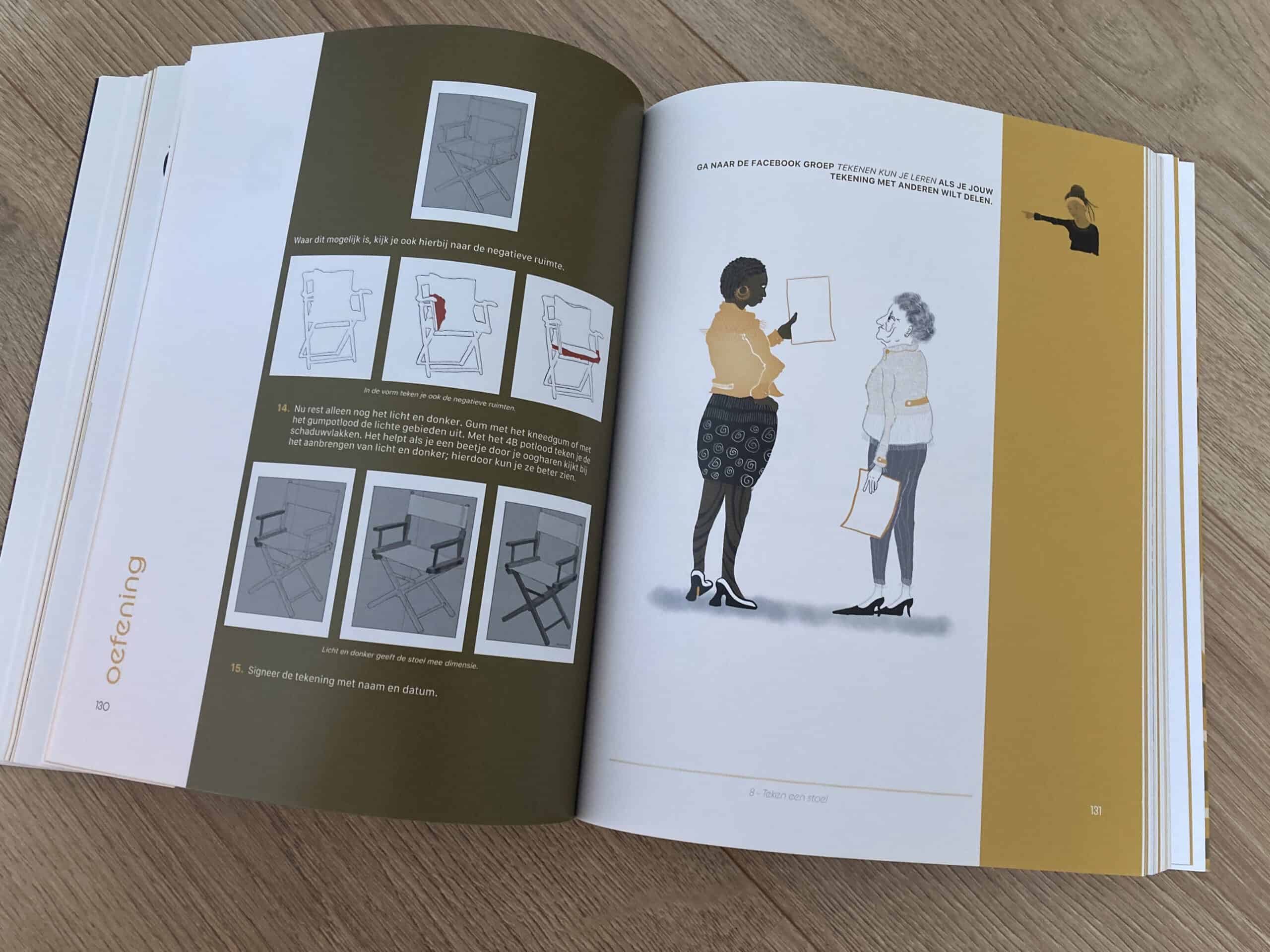
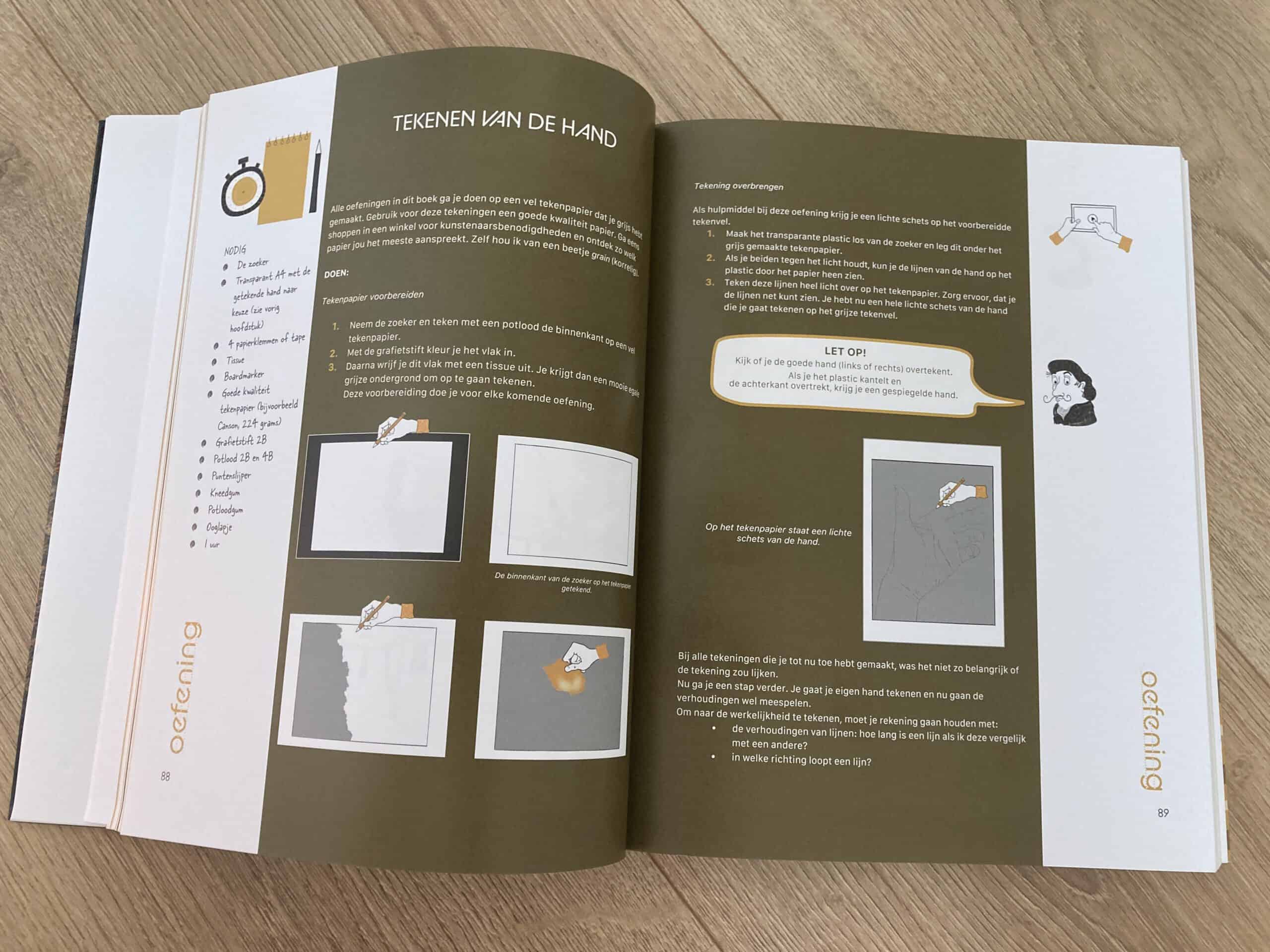
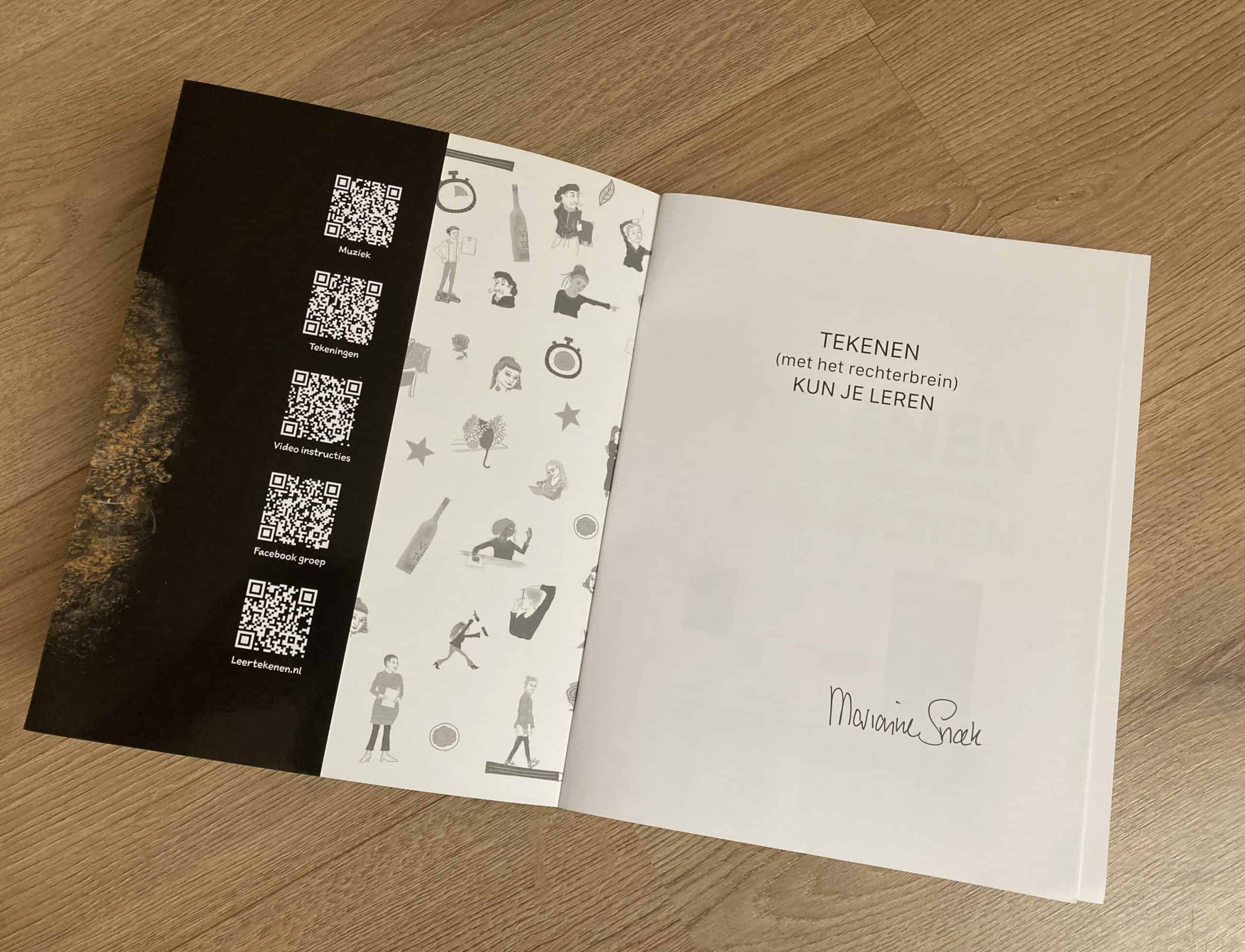
Author Marianne Snoek. Illustratrice Cornelie Gogelein.
208 pages. Published in May 2022. Printed by New Energy
You can order the book on the website of Marianne Snoek: leertekenen.nl
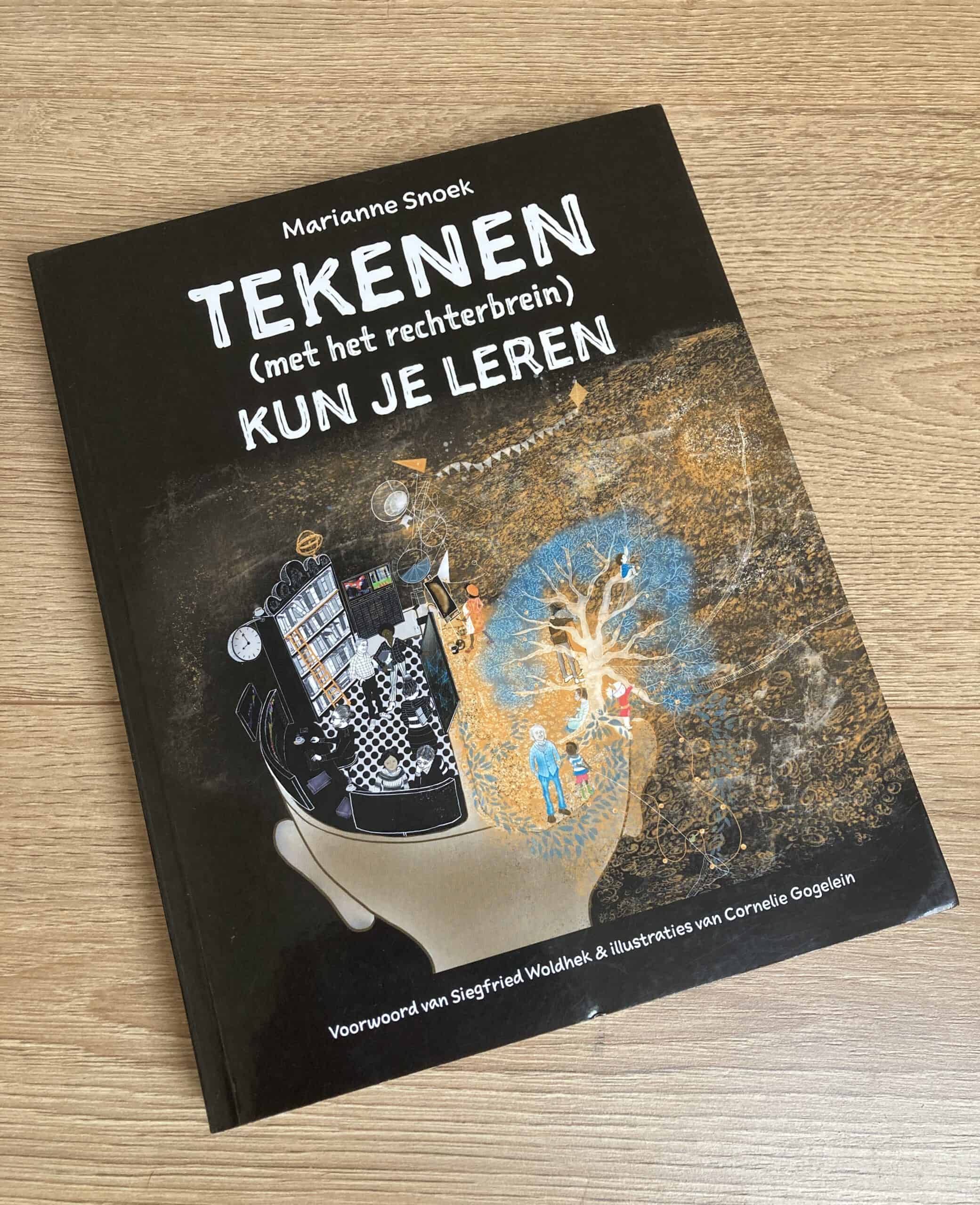
This 5-month project in 2021 became a passionate work collaboration with Marianne Snoek. and the amazingly talented illustratrice Cornelie Gogelein. I learned a lot including drawing by starting implementing the exercices from the book.
In 2022, a third revised and enhanced edition is available from August.
You can order the book on the website of Marianne Snoek: leertekenen.nl
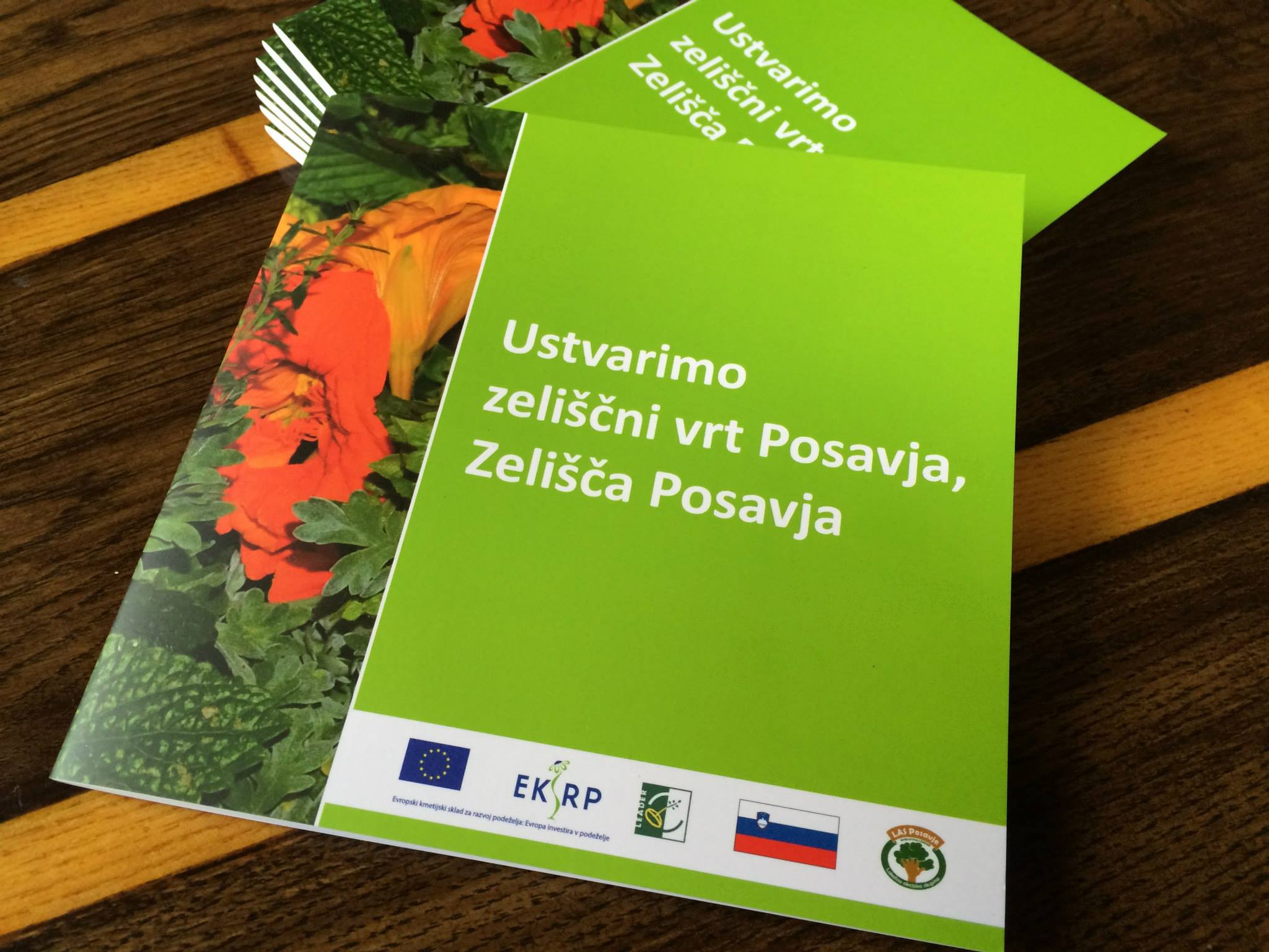
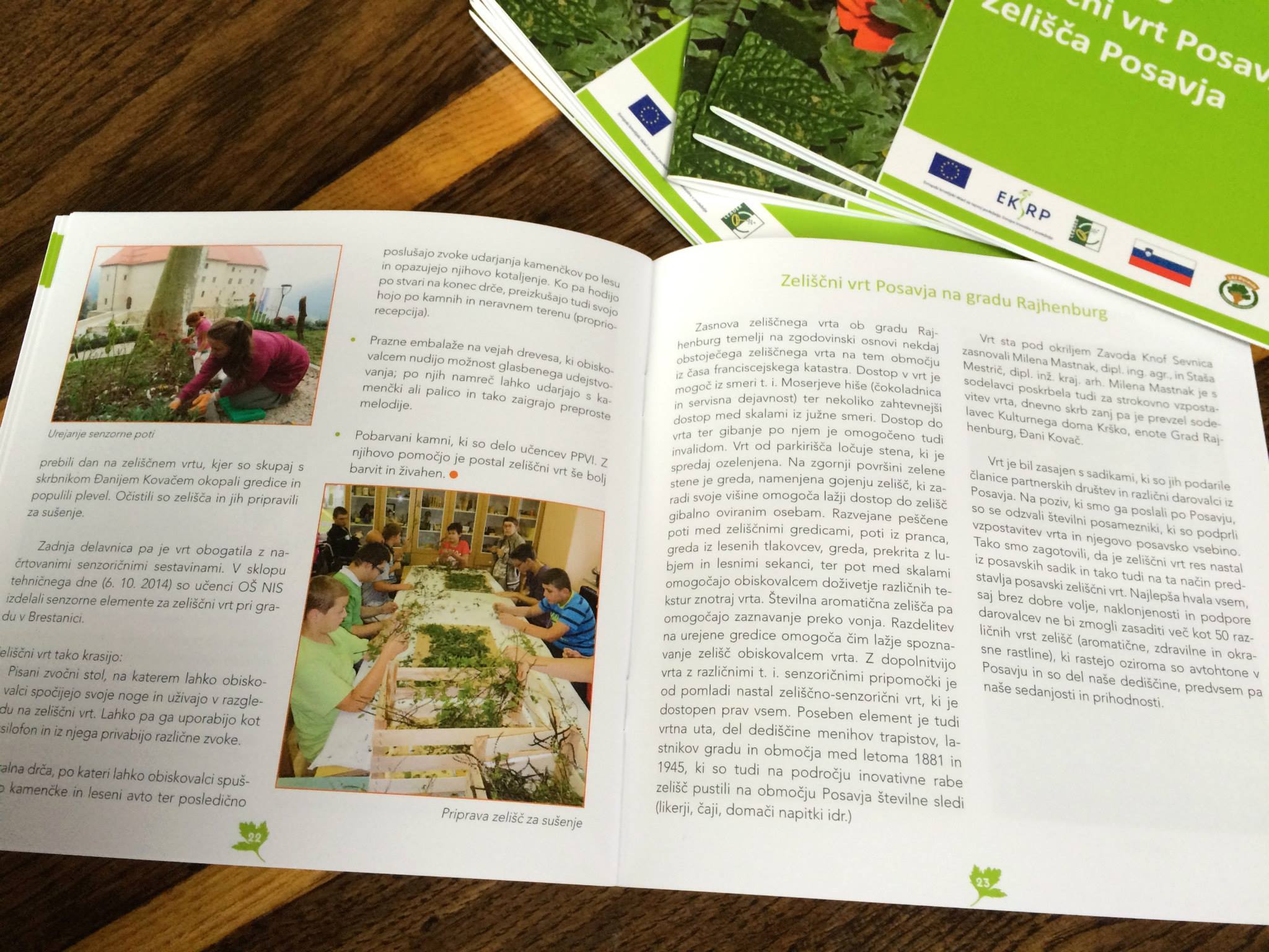
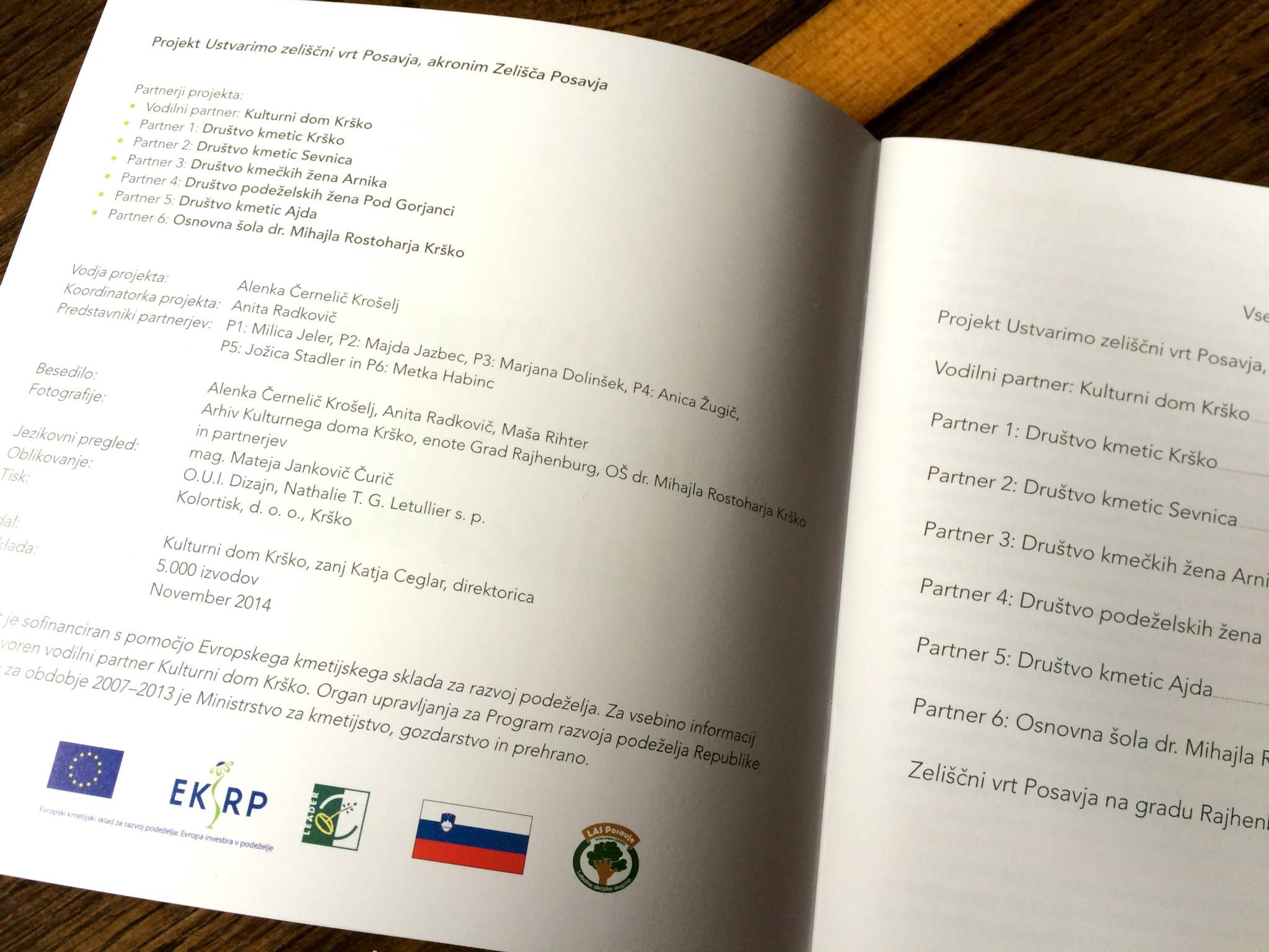
This is a brochure I designed when living in Slovenia, for the local Culture Centre.
It is about a project for herb garden planted by the Rahjenburg Castle in Brestanica. Castle Rajhenburg
Size: 16x16cm,
24 page, 4/4 colours,
offset 5000 copies
Client: Kulturni dom Krško
Printery: Kolortisk Krško
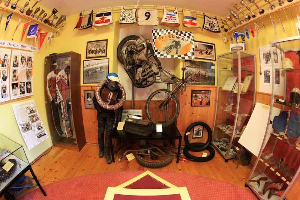
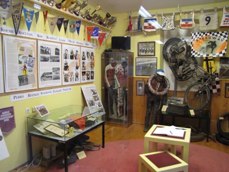
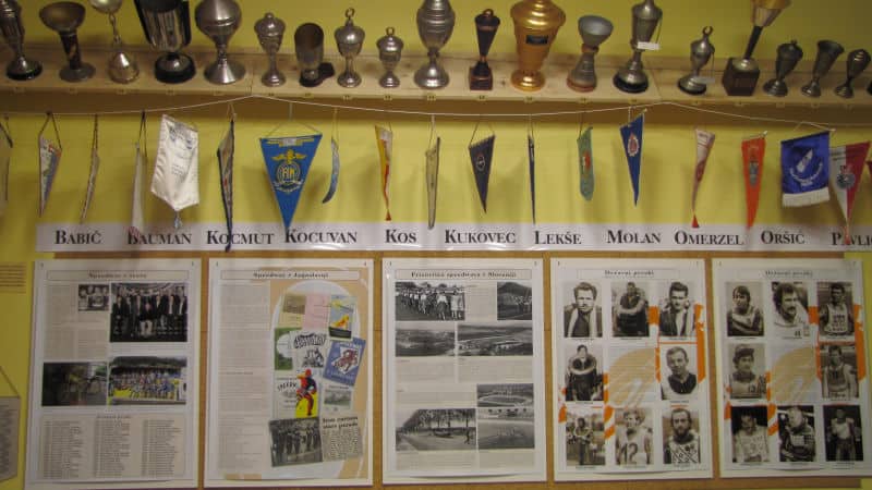
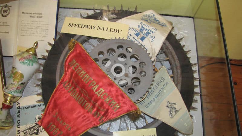
We designed and layout in only 2 weeks one room from the local library and transformed it in a mini-museum in 2009 relating the history and champions of Speedway in Slovenia and over the World. I designed all informative panels and modernized the retro Speedway logo. On the special opening day full of emotions came former legends of Speedway from all over Slovenia to cut the ribbon and celebrate this small part of Slovene history, for which I had the privilege to bring my creativity.
The Museum is still open and can be visited on request.
Check out the result: Speedway Museum in Krško, Slovenia
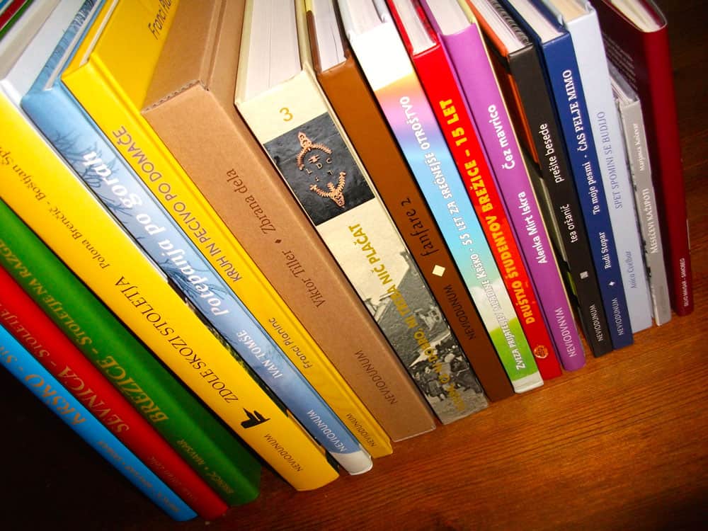
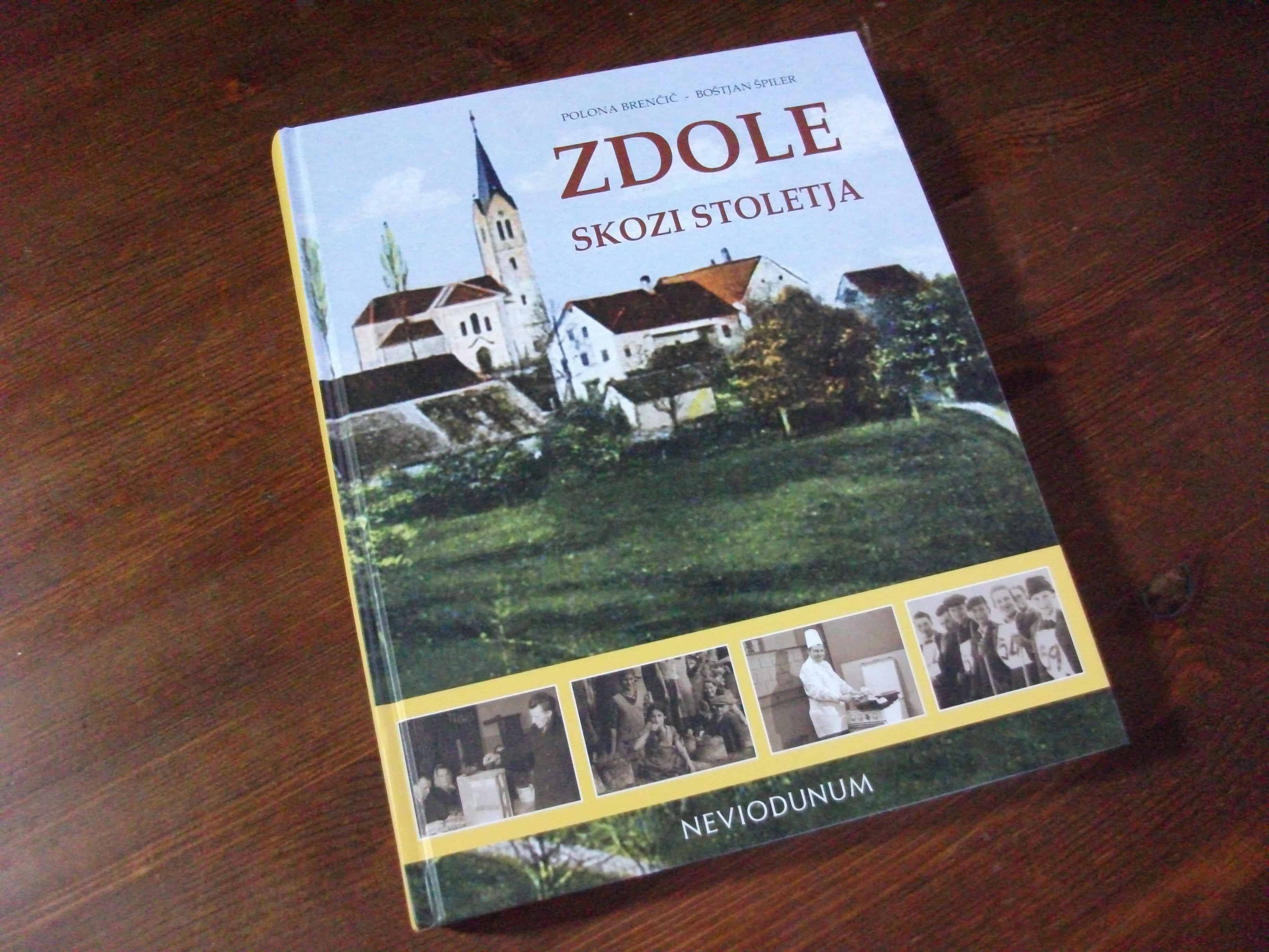
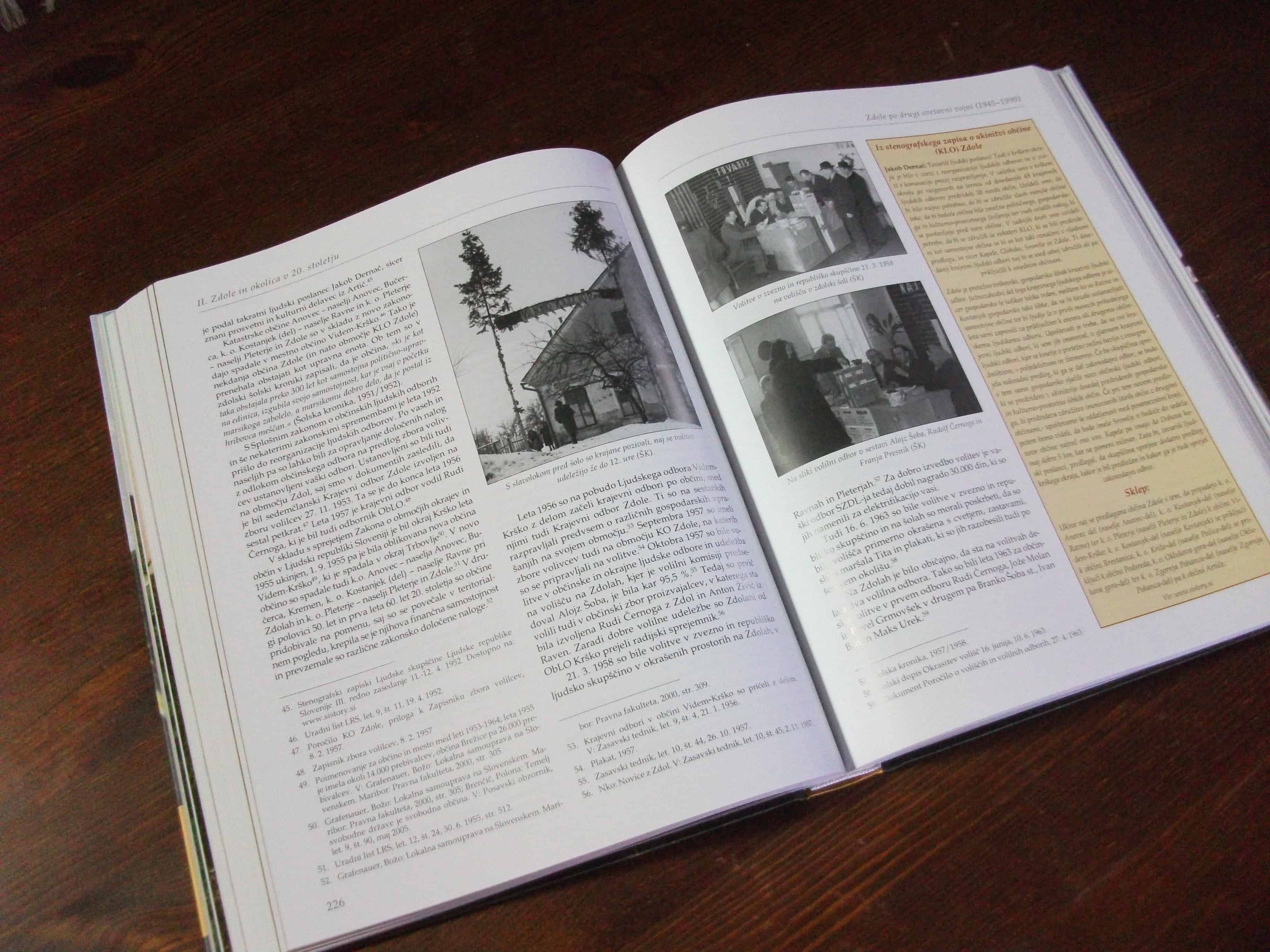
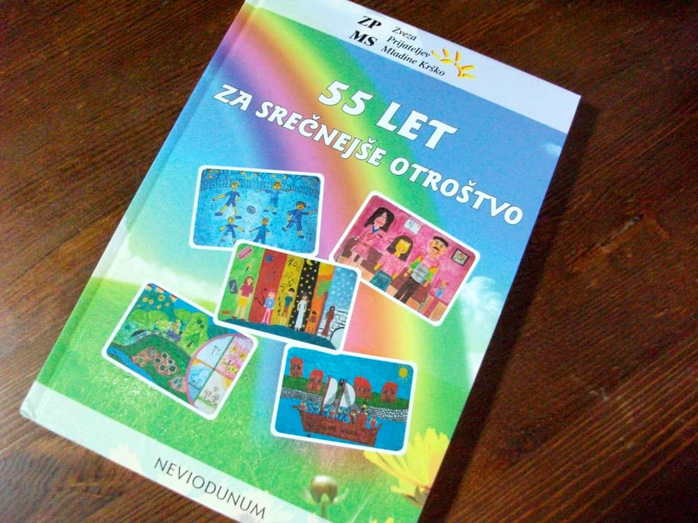
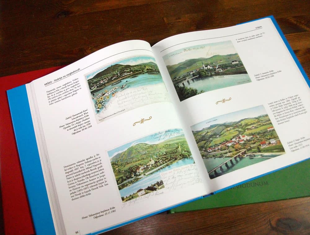
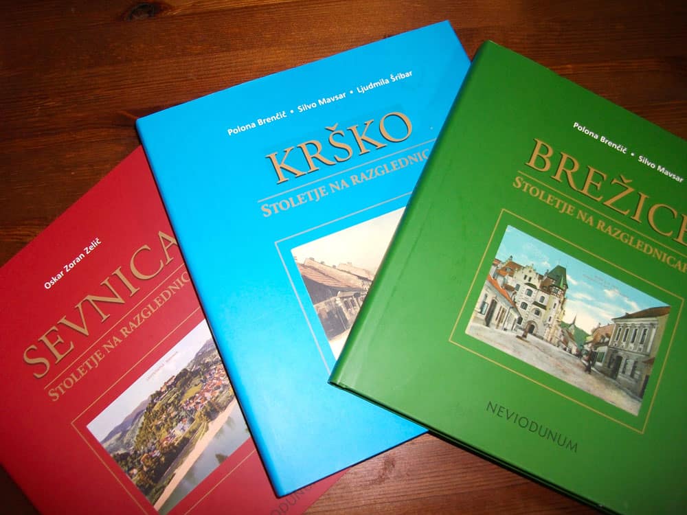
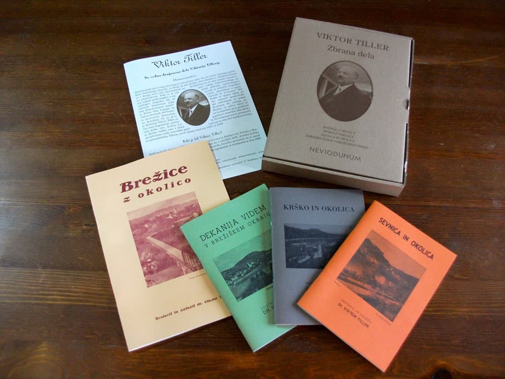
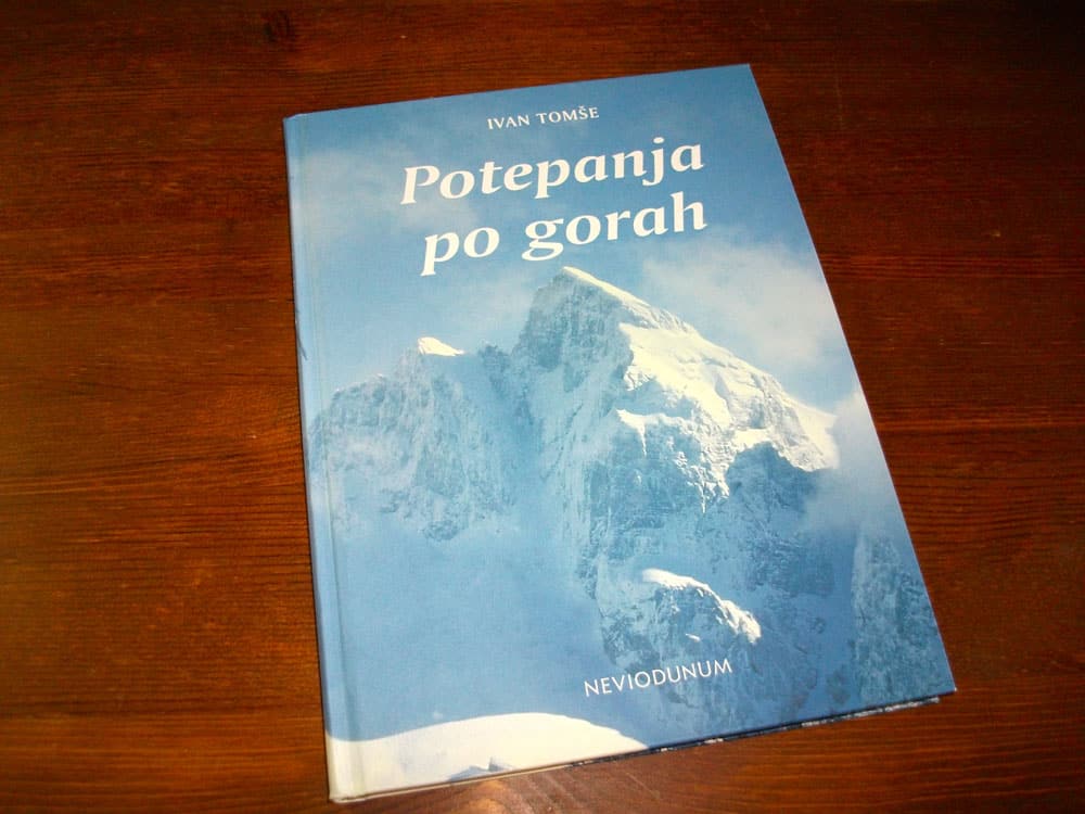
For nearly 4 years, I was the inhouse graphic designer for a book publishing not-for-profit company and newspaper editor.
17 books were published (themes: history, biography, poetry, cooking, sport, etc …), mostly hardcovers.
I also designed and did the layout of articles and advertising spaces in the newspaper (Posavski Obzornik, www.posavje.info), photography (book covers, portraits), designed the corporate identity of the company itself (business cards, marketing dossier, logos, banners for events, flags, street billboards, etc…).
I built also with Joomla a complete website www.neviodunum.si and was in charge of the original creation, design and development of the web portal of the Institute.
Some of the books are still for sale by the publisher on its current website:
Books from Posavje Region

The client wanted to refresh the design of its old html website and have it integrated into WordPress by its developer, the colors were defined in advance and the media and texts were delivered to me upon signing the project.
I started deep in the project with research into the competitors of the injection moulding sector to see what they were doing, what was working well and what was the first impression when visiting their website. I studied all the materials that I had been sent. I built out the website framework following the guidelines with the focus on attractive layouts, dynamic colours and infos on the page easy to find.
I used the main frame and adapted it to each page required with all content I had to produce, multiplied by 3 for Desktop, Tablet and Mobile. I created a mini 2D text animation as per request.
Once integrated to WordPress, the website went Live dressed with its new energetic and colourful design.
Check out the result: MPI

My client wanted to refresh the design of its website and have it integrated into WordPress by its developer; the site map, media and texts were delivered to me upon at the very start of the project. This was ideal and allowed a quick and effective work flow. Specific icons needed to be created to make the different fields of expertise visible and clear at first sight. Vivid colors had to be used.
I started deep in the project with research into the competitors of this industrial sector to see what they were doing, what was working well and what was the first impression when visiting their website. I tested some color profiles that represented the industry and I started to apply them along with representative icons I drew and modified.
I took a content-first approach and designed clear website pages following the site map, which would ease finding the field of work aimed by customers when browsing the website.
I customized each page per device to be responsive. The whole design was structured around the key goal of being informative about the services and projects that could be offered to clients. Once approved the final design was delivered as Photoshop files.
The website went Live after easy integration by the developper.
Check out the result: Industrial Maintenance